http://www.telegraph.co.uk/business/201 ... -redesign/Formula One is on track for a collision with 3M, the maker of Scotch tape and Post-it Notes, after it emerged that the sport’s new logo bears a striking resemblance to a pan-European trademark registered by the American conglomerate.
The new logo was unveiled at the Abu Dhabi Grand Prix in November as part of a re-branding plan by Liberty Media which bought F1 for $8bn (£5.8bn) at the start of 2017. It hopes to launch it on a new clothing range at the 2018 season-opener in March but 3M’s trademark registration could put the brakes on that.
F1’s previous logo had been used for 23 years and cleverly created the silhouette of a number one between a slanted letter “F” and the speed lines opposite it. In contrast, the “F” in its successor is simply formed from a curved stripe with a white line running through it followed by a line which represents the number one. It was created by Wieden+Kennedy and has had a frosty reception, derided by fans and industry figures alike.
An “F” in the same style has been used by 3M for the past year as the logo of its Futuro brand of compression tights for airline passengers.
A 3M spokesman said: “3M filed a US trademark application for the Futuro logo on Feb 20 2017. Also, we have not had any discussions about the logo with the other party. We are looking into this matter further.”
The filing gives 3M precedence as F1 didn’t lodge the application for its new logo until November and EU authorities are still deciding whether to register it.
Oops, seems FOM didn't do their research on their new logo...
-
myownalias

- Silver Member

- Posts: 285
- Joined: 6 years ago
- Favourite Motorsport: F1
- Favourite Driver: Daniel Ricciardo
- Favourite Circuit: Spa Francorchamps
- Car(s) Currently Owned: Ford Fusion (3.0L V6)
- Location: Wichita, KS
- Contact:
Oops, seems FOM didn't do their research on their new logo...
F1 could be in for some more embarrassment as their new logo launched with much fanfare in Abu Dhabi might have to be rolled back as the logo has a striking resemblance to 3M's registered trademark for their Futuro brand.
-
Antonov

- Legendary Member

- Posts: 13646
- Joined: 15 years ago
- Real Name: Tobias
- Favourite Motorsport: Formula 1
- Favourite Racing Car: MP4/13 ; F40
- Favourite Driver: M. Hakkinen
- Favourite Circuit: Some shitty street circuit
- Car(s) Currently Owned: VW Golf GTI
- Location: home

-
kals

- Legendary Member
- Posts: 28276
- Joined: 16 years ago
- Real Name: Kieran
- Favourite Motorsport: F1..BTCC..MotoGP
- Favourite Racing Car: Benetton B189
- Favourite Circuit: Donington Park
- Location: New Jersey
Keep it simple? That's multiple fonts and colours, and also pre-historic. Let's bring back open face helmets while we're at it.
While there are obvious similarities the F1 and Futuro logos are not identical. And besides, if F1 is unable to use that logo / font style then 3M should have gone after Juventus too
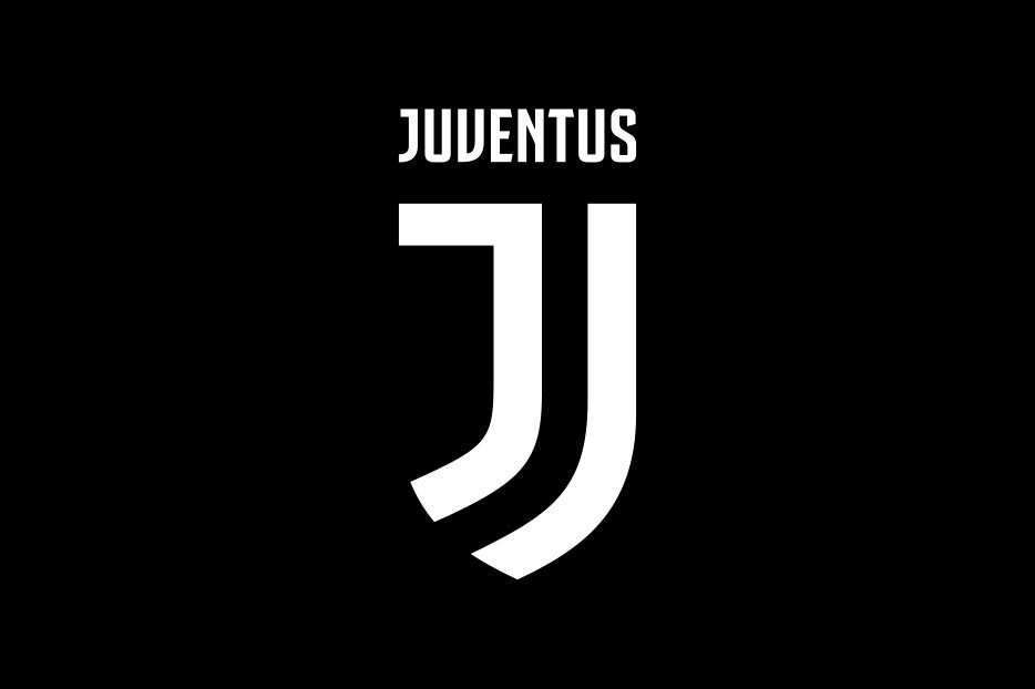
Oh and Juve have been using this logo months before 3M registered the Futuro logo.
While there are obvious similarities the F1 and Futuro logos are not identical. And besides, if F1 is unable to use that logo / font style then 3M should have gone after Juventus too
Oh and Juve have been using this logo months before 3M registered the Futuro logo.
-
PTRACER

- Forum Administrator

- Posts: 42151
- Joined: 20 years ago
- Real Name: Paul
- Favourite Motorsport: Formula 1
- Favourite Racing Car: Lotus 49
- Favourite Driver: Gilles Villeneuve, James Hunt
- Favourite Circuit: Nordschleife
- Car(s) Currently Owned: Mitsubishi Lancer Evo X JDM
- Contact:
That would be a bit embarrassing if they had to change it again after such a big furore. But again, as people said back then, "it's just a logo", let's worry about things that matter.
Developer of the 1967v3 Historic Mod for Grand Prix Legends: viewtopic.php?t=17429
King of the Race Track, Destroyer of Tyres, Breaker of Lap Records
King of the Race Track, Destroyer of Tyres, Breaker of Lap Records
-
MonteCristo

- Moderator

- Posts: 10713
- Joined: 8 years ago
- Favourite Motorsport: Openwheel
- Favourite Racing Car: Tyrrell P34/Protos
- Favourite Driver: JV
- Favourite Circuit: Road America
- Location: Brisbane, Australia
For the minor lulz, I hope they have to change it.
Oscar Piastri in F1! Catch the fever! Vettel Hate Club. Life membership.
2012 GTP Non-Championship Champion | 2012 Guess the Kai-Star Half Marathon Time Champion | 2018 GTP Champion | 2019 GTP Champion
2012 GTP Non-Championship Champion | 2012 Guess the Kai-Star Half Marathon Time Champion | 2018 GTP Champion | 2019 GTP Champion
-
Everso Biggyballies

- Legendary Member
- Posts: 49191
- Joined: 18 years ago
- Real Name: Chris
- Favourite Motorsport: Anything that goes left and right.
- Favourite Racing Car: Too Many to mention
- Favourite Driver: Kimi,Niki,Jim(none called Michael)
- Favourite Circuit: Nordschleife, Spa, Mt Panorama.
- Car(s) Currently Owned: Audi SQ5 3.0L V6 TwinTurbo
- Location: Just moved 3 klms further away so now 11 klms from Albert Park, Melbourne.
I think there is no doubt.... the 'f' part is an absolute dead ringer for the 3M original. For a company like Liberty that holds it's marketing prowess so high it is totally unprofessional to launch a logo without any due diligence being done. It is an error perhaps expected of a year 1 college student not an organisation like Linerty. I wonder if if it was designed in house of subbed out to some agency.
Ironically shit like this is something where Bernie would excel at minimising damage.... I fear Liberty will be paying a healthy royalty to 3M or maybe healthy damages and a complete redesign.
Ironically shit like this is something where Bernie would excel at minimising damage.... I fear Liberty will be paying a healthy royalty to 3M or maybe healthy damages and a complete redesign.
* I started life with nothing, and still have most of it left
“Good drivers have dead flies on the side windows!” (Walter Röhrl)
* I married Miss Right. Just didn't know her first name was Always
-
kals
- Legendary Member
- Posts: 28276
- Joined: 16 years ago
- Real Name: Kieran
- Favourite Motorsport: F1..BTCC..MotoGP
- Favourite Racing Car: Benetton B189
- Favourite Circuit: Donington Park
- Location: New Jersey
So what you're saying is that Liberty could be a in a tight(s) spot?Everso Biggyballies wrote: ↑6 years ago I think there is no doubt.... the 'f' part is an absolute dead ringer for the 3M original. For a company like Liberty that holds it's marketing prowess so high it is totally unprofessional to launch a logo without any due diligence being done. It is an error perhaps expected of a year 1 college student not an organisation like Linerty. I wonder if if it was designed in house of subbed out to some agency.
Ironically shit like this is something where Bernie would excel at minimising damage.... I fear Liberty will be paying a healthy royalty to 3M or maybe healthy damages and a complete redesign.
(for those that don't get my joke, Futuro by 3M are compression tights for airline passengers).
My take on this is that this is a landgrab by 3M. They are (rightly) attempting to protect a logo copyright however the F1 and Futuro products in question are hardly similar, the two logos while similar are not exactly the same and there are many cases of precedents being set where logos from other companies (in differing industries) look very similar but are not the same...
